|
|
|
|
|
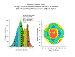
These two graphs display data from a study of dislocation densities on disk-shaped semiconductor wafers. The first graph is a histogram generated from data stored in multiple worksheets. The second graph is a scatter plot of the location of a measured value on the wafer.
Read
more... More of same type...
More by same keywords...
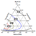
This ternary diagram displays the packing fraction when three particle types are combined. Each line in the graph represents a constant value for the packing fraction as a function of the fractional contribution of the three particles (course, fine, and medium) in the mixture.
Read
more... More of same type...
More by same keywords...
|